I apologize if the vast majority of you have already seen the pics of our house finished on Facebook. I figured my work on the house warranted a blog post. It kind of consumed my life for 4 feverish days as I hussled to get things settled before the family's decent upon KC.
Here's the front of the house. It hasn't really hasn't changed much at all aside from the mountains of leaves from the sourrounding trees, and the slightly less vibrant shade of green of the grass (think instead...brown)
The only other major differences are that we now have a mailbox and the windows are actually covered. Here's to not living in a fishbowl!
I'll try to lay this out in terms of before and after photos. I'm not sure how well that's going to work, but we'll see.
Foyer Before:
Note that the color of the walls is kind of a khaki color. Also note that the light fixtures are reminiscent of breasts. I always wonder why it's okay to have a light fixture that clearly looks like a boob. You don't see light fixtures all over the place that look like testicles. Seems unfair...but I digress. I also didn't particularly dig the fact that the light fixture was an opaque amber color. This picture has freakish amounts of light in it, but in reality, the house doesn't have a ton of natural light. Seemed like problem.
Foyer After:

So you can see that we drastically lightened the color of the room. In addition, we've added light fixtures that don't really resemble any male or female naughty parts. I painted some craziness on the curved wall and added greenery and art. (Don't be fooled by the greenery, though...it's totally fake. Chai would destroy any real plant we brought into our home within a matter of minutes.)
Hearth Room Before:
Okay, so it's going to become abundantly clear by looking at all the before pictures, that these were professionally taken, and with a wide angle. So here's the hearth room. The light fixture has those lame tulip light globes, the metal is oil rubbed bronze, and again, the light globes are opaque amber colored. Against the brownish khaki walls, there wasn't a ton of light.
Hearth Room After:
Okay, so here, you'll see that we changed the color of the walls to a lighter color, painted some crazyness on the wall, mounted a tv, added some furniture, some art, and changed the light fixture. Out of all the rooms in the house, I think this one is the least done. The walls that are straight ahead and to the right are pretty white. I'm waiting on a friend of mine to paint some wicked art for me to brighten up the walls.
Kitchen Before:

The Kitchen was pretty okay...well, for most people. Since I'm what one would call "particular", I had a lot of beef with it. I hated the doors of the cabinets because of the country looking arch at the top. I hated the pulls on the doors. I hated the light fixture, the backsplash, and the fact that the appliances were black and not stainless. Don't worry, folks...I took care of business!
Kitchen After:
I made this photo obnoxiously large for several reasons:
1) A small photo doesn't do it justice because the new backsplash is amazeballs and needs to be seen larger.
2) It's my favorite part of the house
3) In it's small size you can't see all the differences.
Speaking of differences, the most obvious are the paint colors, the addition of the fridge, swapping the appliances out for stainless, the light fixtures, the cabinet doors, and the cabinet door pulls. This is pretty much my ideal, aside from the faucet. It's the last bit of oil rubbed broze to banish from our place.
Dining Room Before:
The dining area is right off the kitchen. Really, aside from the paint color, all this room needed was a different light fixture, some furniture, and some color.
Dining Room After:
Blam. Added some furniture, some window treatments, some art, and a bookshelf of knick knacks. Oh, and we changed the paint color and light fixture.
Master Bedroom Before:
All this room really needed was some furniture and color.
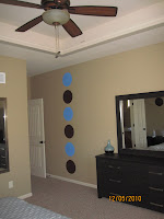
Master Bedroom After:
Upstairs Guest Bedroom Before:
Upstairs Guest Bedroom After:
Great Room Before:
Great Room After:
Downstairs Guest Bedroom Before:
Downstairs Guest Bedroom After:


OMG - Stenciling WIN!!!! Friend of a friend of yours sent me your link. I'm trying to get some inspiration for my teeeny tiny 1st floor powder room. Wallpaper is out for price reasons -- I refuse to pay $100 a roll for any wallpaper on principle alone. So stenciling it is. Thanks for the inspiration to go forward!
ReplyDeleteJust as a helpful hint: I don't use stencils...I just use plain ol' painters tape. My favorite brand is frog tape...it keeps the lines really clean. You apply the tape to the wall and paint inside the lines...it's really easy and you can get really creative with it. Good luck!
ReplyDelete